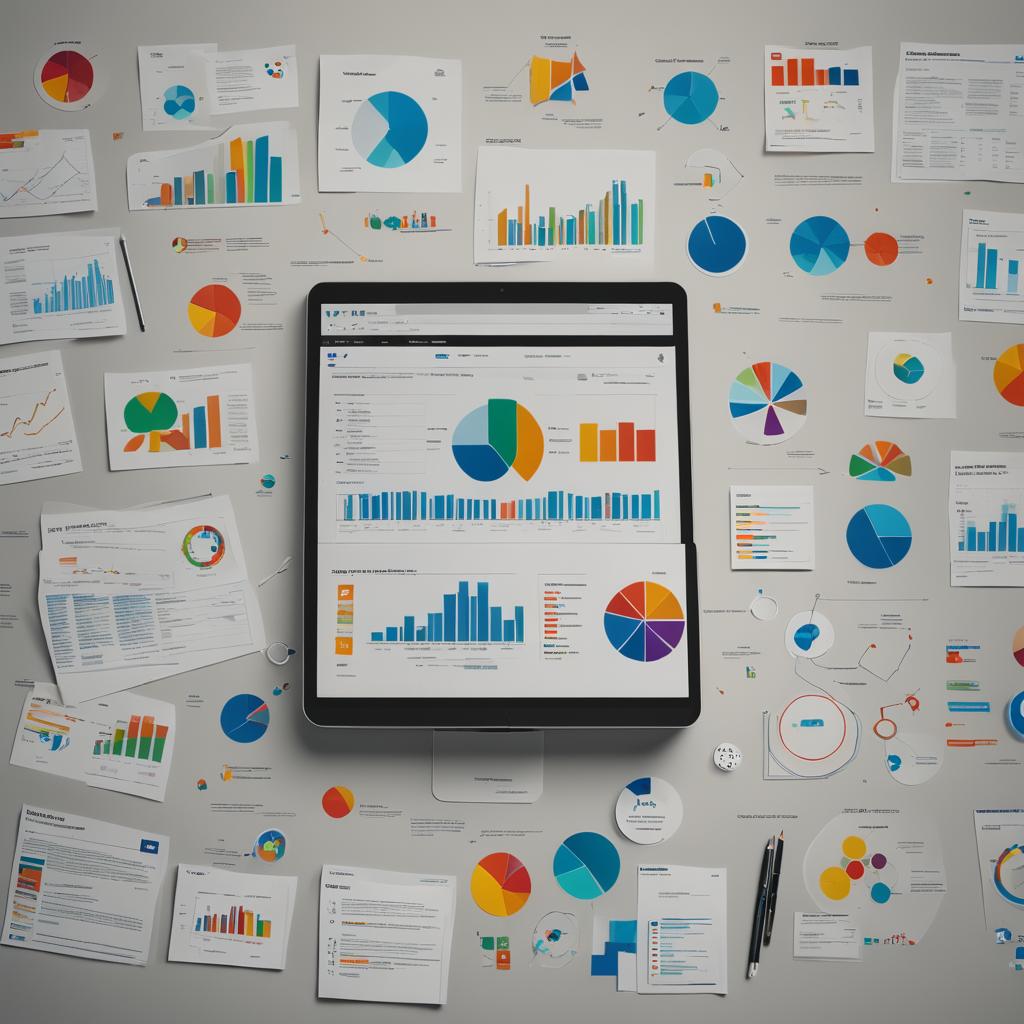
Unlock the power of data with these incredible free data visualization tools! Whether you’re a graphic designer, student, or business analyst, these tools will help you present information in a compelling and visually appealing manner. Dive into our comprehensive guide to discover the best options available, complete with detailed evaluations and key features highlighted for each tool.
Tableau Public is a powerful, free tool that enables users to create stunning and interactive visualizations. With its intuitive drag-and-drop interface, you can effortlessly transform data into insightful charts and graphs. Ideal for anyone from students to professionals, Tableau Public is known for its extensive community and vast array of resources for learning and sharing visualizations.
Notable Features:
Interactive Dashboards: Create dynamic and engaging dashboards.
Large Community: Access a vast library of public visualizations and resources.
Multiple Chart Types: Choose from a wide variety of chart types and formats.
Pricing: Free for public use.
Pros and Cons:
Pros
Cons
Intuitive drag-and-drop interface
Requires internet connection for public sharing
Extensive learning resources
Limited data privacy
Wide range of visualization options
No offline access
Audience: Suitable for students, educators, data analysts, and business professionals.
Verdict: Tableau Public stands out for its ease of use and vibrant community, making it a top choice for those who want to create and share interactive visualizations. ☆
Google Data Studio provides a free and robust platform for turning your data into informative, easy-to-read, easy-to-share, and fully customizable dashboards and reports. It integrates seamlessly with other Google services like Google Analytics and Google Sheets, making it a versatile choice for marketers and business analysts.
Notable Features:
Google Integration: Easily integrates with Google Analytics, Sheets, Ads, etc.
Customizable Templates: Access a variety of templates for quick setup.
Real-Time Data: Update your visualizations in real-time.
Pricing: Free for all users.
Pros and Cons:
Pros
Cons
Seamless Google product integration
Limited advanced visualization options
Real-time data updates
Requires Google account
User-friendly interface
Customization can be complex for beginners
Audience: Perfect for marketers, small business owners, and data analysts.
Verdict: Google Data Studio is an excellent tool for those deeply embedded in the Google ecosystem, offering real-time data integration and user-friendly customization. ☆
Microsoft Power BI is a robust data visualization tool that provides a suite of tools for business analytics, helping users visualize their data and share insights across their organization. The free version of Power BI is powerful enough for small to medium-sized projects and offers a wide range of features for data integration and visualization.
Notable Features:
Data Integration: Connect to hundreds of data sources.
Professional Reports: Create detailed and professional reports.
Mobile Access: Access reports on mobile devices.
Pricing: Free version available with limited features.
Audience: Ideal for business professionals, analysts, and IT professionals.
Verdict: Microsoft Power BI offers comprehensive data integration and professional reporting capabilities, making it a great choice for business analytics. ☆
Chart.js is a simple yet flexible JavaScript library for designers and developers who want to create attractive charts and graphs. It’s lightweight and comes with a variety of chart types to choose from, allowing for customization and integration into web projects.
Notable Features:
Responsive Charts: Automatically resize charts to fit screens.
Customizable: Highly customizable with simple JavaScript configuration.
Multiple Chart Types: Supports line, bar, radar, doughnut, pie, polar area, and bubble charts.
Pricing: Free and open-source.
Pros and Cons:
Pros
Cons
Lightweight and fast
Requires coding knowledge
Highly customizable
Limited to JavaScript environment
Free and open-source
Lacks advanced features found in other tools
Audience: Best for web developers and designers.
Verdict: Chart.js is perfect for developers seeking a lightweight and customizable charting library for web projects. ☆
D3.js is a powerful JavaScript library that allows developers to produce sophisticated and highly customizable data visualizations. With D3, you can bind data to a Document Object Model (DOM) and apply data-driven transformations to the document. It’s ideal for creating complex visualizations that need to be highly customized.
Notable Features:
Data Binding: Bind data to DOM elements for dynamic visualizations.
Customizable: Extensive customization options for advanced users.
Interactive Visuals: Create highly interactive and animated graphics.
Pricing: Free and open-source.
Pros and Cons:
Pros
Cons
Extremely powerful and flexible
Steep learning curve
Wide range of visualizations
Requires deep knowledge of JavaScript and web standards
Free and open-source
Not beginner-friendly
Audience: Suitable for experienced developers and data scientists.
Verdict: D3.js is unmatched in its flexibility and power, perfect for advanced users needing highly customizable visualizations. ☆
Plotly is a versatile tool known for its high-quality interactive visualizations. The free version, known as Plotly.js, is an open-source library that supports a variety of chart types and is widely used for scientific, statistical, and financial data visualization.
Notable Features:
Interactive Charts: Create interactive charts and dashboards.
Web Integration: Easily integrate into web applications.
Wide Range of Charts: Supports a variety of chart types including 3D plots.
Pricing: Free for open-source version.
Pros and Cons:
Pros
Cons
High-quality interactive visualizations
Can be complex for beginners
Supports many chart types
Limited features in the free version
Strong community support
Performance can be an issue with large datasets
Audience: Ideal for scientists, researchers, and data analysts.
Verdict: Plotly offers robust, high-quality interactive visualizations, making it a top choice for professionals in scientific and research fields. ☆
Infogram is a user-friendly tool designed for creating stunning infographics and interactive charts. Its drag-and-drop editor and wide array of templates make it accessible for users with no technical background, making it a favorite among marketers and educators.
Notable Features:
Drag-and-Drop Editor: Simple and intuitive design interface.
Customizable Templates: Access a vast library of pre-designed templates.
Interactive Elements: Add interactive elements like maps and charts.
RAWGraphs is an open-source web-based tool that simplifies the process of turning complex data into easy-to-understand visualizations. It’s especially useful for those who need to visualize structured data quickly without needing extensive coding knowledge.
Notable Features:
Easy Data Import: Simple import from spreadsheets and CSV files.
Customizable Visuals: Customizable and exportable visualizations.
User-Friendly Interface: Designed for ease of use with minimal learning curve.
Pricing: Free and open-source.
Pros and Cons:
Pros
Cons
No coding required
Limited to structured data
Quick data import and export
Fewer customization options compared to advanced tools
Free and open-source
Limited interactivity
Audience: Suitable for researchers, journalists, and designers.
Verdict: RAWGraphs is an excellent choice for quickly visualizing structured data with minimal effort. ☆
Datawrapper is a tool designed to make it easy for anyone to create simple, clean, and responsive charts and maps. It’s particularly popular among journalists and newsrooms for its ease of use and quick publishing capabilities.
Notable Features:
Map Visualizations: Create detailed and interactive maps.
Responsive Charts: Ensure your charts look great on any device.
Easy Embedding: Easily embed charts into websites and articles.
Pricing: Free version available with limited features.
Pros and Cons:
Pros
Cons
No coding skills required
Limited advanced features in free version
Quick and easy to use
Watermarked in free version
Excellent for journalists
Limited customization options
Audience: Ideal for journalists, educators, and bloggers.
Verdict: Datawrapper excels in creating quick, clean, and responsive visualizations, making it a favorite among journalists. ☆
ChartBlocks offers an easy-to-use platform for creating charts quickly. With its chart builder, you can import data from multiple sources, customize your charts, and share them easily. It’s designed for users who need a fast and straightforward charting tool.
Notable Features:
Chart Builder: Simple step-by-step chart building process.
Data Import: Import data from spreadsheets, databases, and live feeds.
Customizable Charts: Customize charts to fit your needs.
Pricing: Free version available with limited features.
Pros and Cons:
Pros
Cons
User-friendly interface
Limited features in free version
Fast data import
Watermarked in free version
Good for quick chart creation
Fewer customization options
Audience: Best for small business owners, educators, and students.
Verdict: ChartBlocks is perfect for users needing a quick and straightforward tool for creating charts. ☆
Free Data Visualization Tools Comparison
Here is a beautiful and responsive comparison table that highlights the key features, pricing, and suitability of each tool to help you make an informed decision.
 1. Tableau Public
 Interactive Dashboards: Create dynamic and engaging dashboards.
 Large Community: Access a vast library of public visualizations and resources.
 Intuitive drag-and-drop interface
 Requires internet connection for public sharing
 2. Google Data Studio
  Google Integration: Easily integrates with Google Analytics, Sheets, Ads, etc.
 Customizable Templates: Access a variety of templates for quick setup.
 Real-Time Data: Update your visualizations in real-time.
 Data Integration: Connect to hundreds of data sources.
 Professional Reports: Create detailed and professional reports.
 Mobile Access: Access reports on mobile devices.
 Responsive Charts: Automatically resize charts to fit screens.
 Customizable: Highly customizable with simple JavaScript configuration.
 Customizable: Extensive customization options for advanced users.
 Interactive Visuals: Create highly interactive and animated graphics.
 Interactive Charts: Create interactive charts and dashboards.
 Wide Range of Charts: Supports a variety of chart types including 3D plots.
 Drag-and-Drop Editor: Simple and intuitive design interface.
 Customizable Templates: Access a vast library of pre-designed templates.
 Map Visualizations: Create detailed and interactive maps.
 Easy Embedding: Easily embed charts into websites and articles.
 Free Data Visualization Tools Comparison

")


")


“We Need to Talk About AI. It’s a Game Changer”
메이저사이트추천